
I like this photo because of the unique angle it was taken from. I feel that it leads your eye up the slide effectively. I also think that the low lighting worked well in this picture, making the contrast between the white sky and dark trees, and the colorful accents of red and blue on the slide. I also like the way that the lighting made the corners of the base of the slide are dark, whereas the center is lighter, providing the photo with depth.

I chose this picture for "leading the eye" because it is simply the most basic example of leading the eye. There isn't anything happening in the background which aids the eye all the more to be lead by the clear path that the tire track makes. Again, the track displays the rule of thirds horizontally.

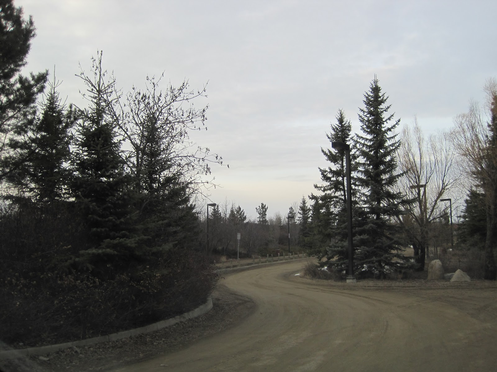
I chose this picture because it's a great example of leading the eye. I feel that the rocks, as well as the path, lead your eye effectively. Although the path that the rocks make is more eye-catching.

I like this pic because it is a good example of the rule of thirds. The road and a couple of the cars meet the rule of thirds pretty well. The road and the trees that run along them also lead the eye.

Ya know what? I really enjoy this picture. Do you enjoy this picture? Well, you should because it exemplifies three important composition techniques. Not only does the lovely cobblestone path and canopy of luscious vines lead your eye to this bench, but this photo also displays balance and the rule of symmetry pretty well. (It's a seller)

I feel that this photo is effective because the audience's eye is lead down the shoreline. There is also a clump of trees (like a mini forest type of thing) on the left side of the photo that your eye is lead to by the shoreline. I think that the lighting was done well- I feel that it adds depth to the photograph. The area that your eye is lead to is very bright and well lit, whereas the less important areas of the photo, compositionally, gradually become darker. Also, the darker trees display the rule of thirds vertically.
No comments:
Post a Comment