Thursday, 29 March 2012

"ISO"


              For this picture I set the ISO at 100. This picture as well as the others in this assignment use the rule of thirds.


              I set the ISO at 200 in order to get this image.


              The ISO is set at 400.


         The ISO is set at 600 in this picture.


            For this picture, the ISO was se tat 800.


            In this photo the ISO was set at 1600.

"Rule of Thirds"


               The basketball net and backboard in this picture follow the rule of thirds. I think that the low lighting worked well in this picture, causing you to focus on the basketball net, which is the focal point of the image, and not be distracted by a ton of unnecessary light. 


 This is a good example of the rule of thirds which is shown by my friend, and the steps lead your eye to the door at the top right hand corner of the photo (which uses the rule of thirds as well).


        Again, my friend demonstrates the rule of thirds. The steps lead the viewer's eyes to the door of the building.


          This picture is effective because the reptile (mainly its head) uses the rule of thirds. I also really like the lighting in this photo. The brightness enhances the depth of the photo.


            This tiny foreign sea creature uses the rule of thirds. I also think that this picture has a good balance, and is very colorful and intriguing.


Wednesday, 28 March 2012

"Lines"


           I think this picture is effective because the horizontal/ almost diagonal lines on the road lead your eye. The road uses the rule of thirds. Also, I really like the bright lighting.


           This photo displays horizontal, vertical, and diagonal lines in the wood panels of the wooden deck and chair. The wooden post on the right of the picture uses the rule of thirds.


       I think that the poles in this ocean represent vertical and horizontal lines well. They make a really unique picture. The poles on the left side also use the rule of thirds.


         This picture is balanced and features vertical lines in the poles holding up the larger bridge, diagonal lines on the blue walkway bridge (which lead the eye), and the sun's reflection in the water is a good example of a perspective line. I like the overall composition of this picture- it's very busy, yet it fits together well.


               I feel that this picture is effective because it is very simple. The tree's trunk (well, it's more of a stick) is a vertical line that leads your eye to the top of the tree.


            This photo fits together well because the ground uses the rule of thirds, and the picture is very balanced and symmetrical. Vertical and horizontal lines form the bars of the fence.


            This ladder shows horizontal, vertical and diagonal lines. I think that this photo is effective mainly because of the interesting angle it was taken from and because of the contrast that the red slide and colorful playground in the background have against the white sky and dark trees.


            This photo pretty much displays every type of line. I think that the angle it was taken from added to its visual appeal. It uses the rule of thirds as well.


         I like this picture because it allows the audience to look from a different perspective- through the rings of a fence. The diagonal lines in this photo give it somewhat of a pattern and consistency, making it balanced.

"Framing"


        I think that this picture is an accurate representation of framing. The trees in the foreground frame the trees in the distance, drawing your eye to them. They also frame the highlighted grass in the center of the picture. One or two of the trees uses the rule of thirds.


        This pic is effective because it is a very basic example of framing. The black rectangle frames the red treble clef, and the collage frames everything inside of the frame. The composition displays balance and is also somewhat symmetrical.


        I enjoy this picture. The jellyfish tank is framed by the dark walls. The contrast draws your eye to the jellyfish in the water. It almost looks like the tank is floating. This picture also shows balance and symmetry.


        Framing is shown in the yellow poles of the swing set which frame the swings. A couple of the trees use the rule of thirds.


        This photo of a tire swing shows framing- the poles frame the swing. I also like the low lighting used in the photo, I think that it works well in this picture.


        I think that this picture is an accurate representation of framing. The playground apparatus frames the tree and the rock. I think the tilted angle that the picture was taken from adds to the effectiveness of the photo- it gives it more visual appeals.

"Balance"


        I think that this picture displays balance. The trees in the foreground and background have equal weight in the photo in terms of color and the amount of space that they take up.


        The flowers in this picture hold equal weight in terms of color and the amount of space they take up, creating balance. I also feel that the high lighting levels worked really well in this photo, accenting the colorful fllowers.


        I think that this picture is effective because it uses several compositional techniques: balance- the trees and building on either sides are balanced well, rule of thirds- shown by the bushes, and leading the eye- the path leading to the building.


        I think that this photo works well because the pine cone in the foreground balances with the trees in the background. The photo also appears visually capturing due to only the front branch and pine cone being in focus while the rest of the photo is out of focus.


      I think that this photo is effective due to its use of the rule of thirds (the water), and the high levels of lighting, as well as the fact that the composition is balanced.

Tuesday, 27 March 2012

"Symmetry"


        I think that this picture is effective because the Chinese lantern is perfectly symmetrical. I also like the bright colors of the lantern, they add to the appeal of the photo.


        This picture is obviously symmetrical, just like every single other picture in this assignment. The shiny newness makes the viewer want to leap into the picture and pick it up.


        This picture I took of the inside of a kaleidoscope is symmetrical. I like the striking busyness. I also like the patterned vivid hues of the beads.


        This is a pic I took of my friend at the U of S, which I enjoy. Coincidentally, it happens to be symmetrical. I like the soft hues that are in contrast with the yellow light. Kayla also demonstrates the rule of thirds.


               This photograph is symmetrical. As well, the lamp post uses the rule of thirds. I like the low level of lighting in this picture because it creates contrast between the sky and the clock, which makes the clock pop.


           Symmetry in action.


"Leading The Eye"


        I like this photo because of the unique angle it was taken from. I feel that it leads your eye up the slide effectively. I also think that the low lighting worked well in this picture, making the contrast between the white sky and dark trees, and the colorful accents of red and blue on the slide. I also like the way that the lighting made the corners of the base of the slide are dark, whereas the center is lighter, providing the photo with depth.


          I think that the picture is effective because the path leads your eyes well. It begins at the bottom of the picture, and continues to lead your eye down the winding path towards the end which uses the rule of thirds. Also, the trees on the right of the photo use the rule of thirds.


         I chose this picture for "leading the eye" because it is simply the most basic example of leading the eye. There isn't anything happening in the background which aids the eye all the more to be lead by the clear path that the tire track makes. Again, the track displays the rule of thirds horizontally.


I chose this picture because it's a great example of leading the eye. I feel that the rocks, as well as the path, lead your eye effectively. Although the path that the rocks make is more eye-catching.
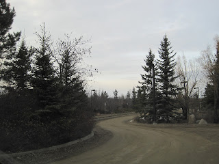


 I like this pic because it is a good example of the rule of thirds. The road and a couple of the cars meet the rule of thirds pretty well. The road and the trees that run along them also lead the eye.


         Ya know what? I really enjoy this picture. Do you enjoy this picture? Well, you should because it exemplifies three important composition techniques. Not only does the lovely cobblestone path and canopy of luscious vines lead your eye to this bench, but this photo also displays balance and the rule of symmetry pretty well. (It's a seller)


          I feel that this photo is effective because the audience's eye is lead down the shoreline. There is  also a clump of trees (like a mini forest type of thing) on the left side of the photo that your eye is lead to by the shoreline. I think that the lighting was done well- I feel that it adds depth to the photograph. The area that your eye is lead to is very bright and well lit, whereas the less important areas of the photo, compositionally, gradually become darker. Also, the darker trees display the rule of thirds vertically.